


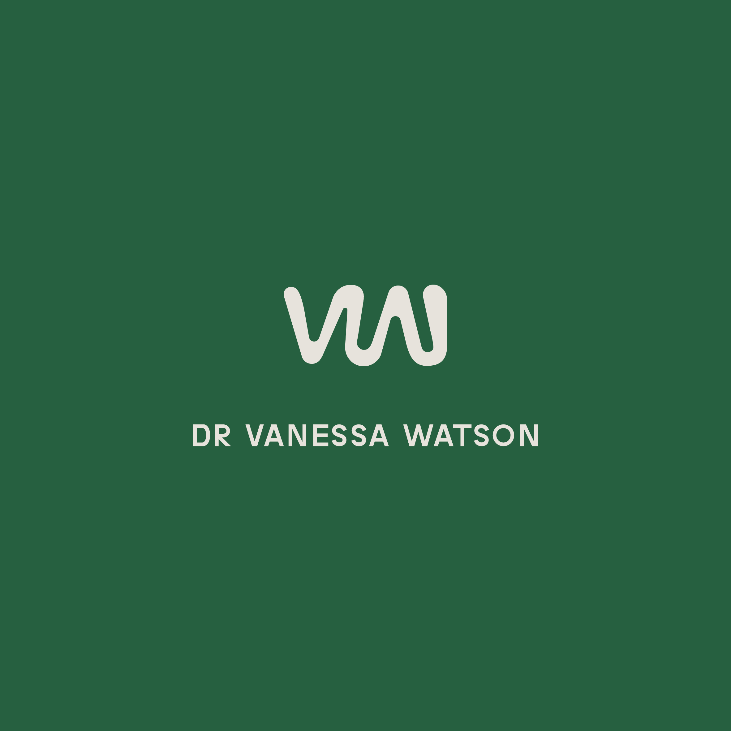

Inkie Studio created a personal brand for Dr Vanessa Watson’s gynaecology practice based in QLD. With a vision towards the future and aims to expand the practice to support more women, Dr Watson was looking to ensure branding continuity and a timeless approach. A logo icon designed to represent Dr Vanessa Watson’s initials (VW), teamed with an in-house typeface by Inkie Studio has been established as the primary brand logo. The VW icon was hand drawn to give a sense of flow, comfortability and a relaxed feel to the brand. This in turn reflects Vanessa as a doctor, and the experience that the practice will bring to women.
A secondary brand icon was also established to represent the brand. This sub-logo takes the primary VW icon and rotates it, adding an irregularly shaped circle - to create an abstract icon of a woman giving birth. This interpretation of the logo icon was designed to be used alongside or as a replacement for the primary logo. This approach gives the brand consistency and flexibility, without the need to completely rebrand in the future.
The primary green and ecru together give a clean, gender neutral colour palette that stands alone amongst other specialists in the O&G space. The dark green with off white / ecru provides contrast so that the logos can be easily read and recognised. Green is a calming colour that will put patients at ease.
Year completed: 2024
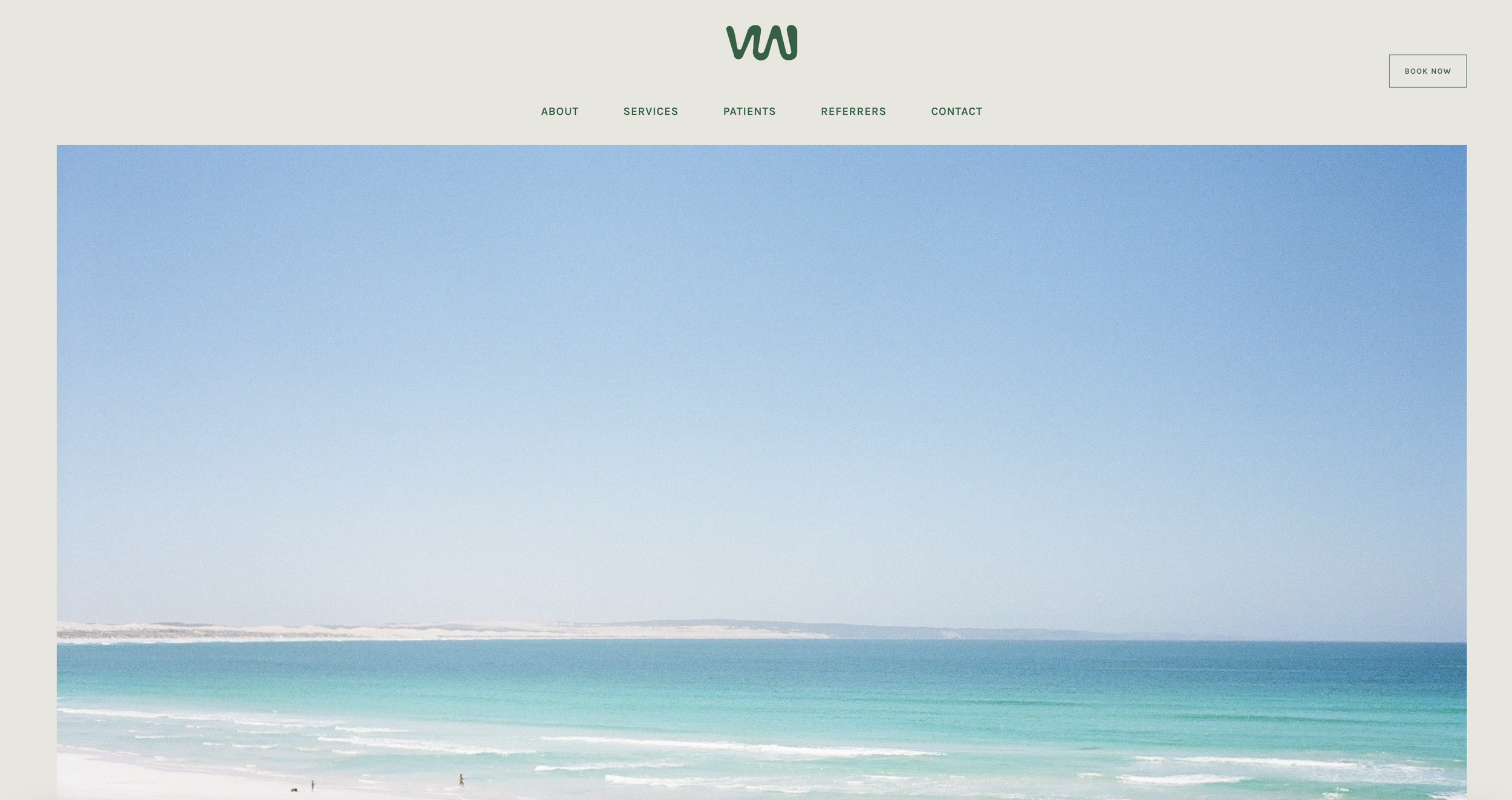
Scope: Logo Identity, Animation, Website Design, Business Cards